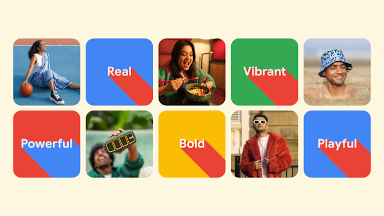
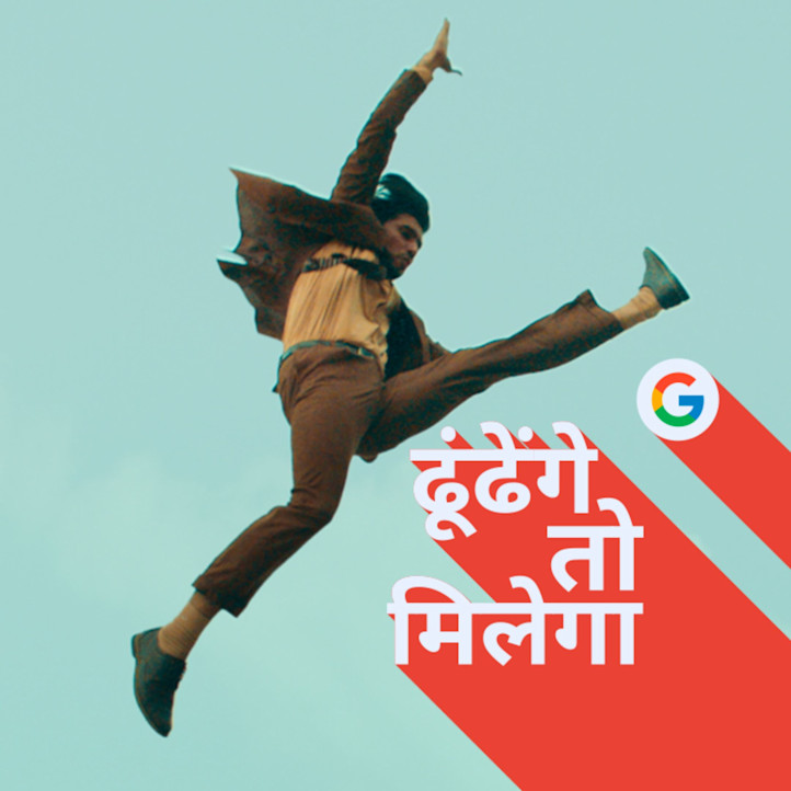
To drive relevance with the future largest demographic of Search users, we developed a brand visual identity that tapped into the world of Gen Z Indians.
Challenge
Google has had the same visual identity for several years in India, which has not evolved with the changing needs of their users. To address this, Toaster was tasked to evolve Google’s visual identity for upcoming Search campaigns, to resonate with a young India, B+C.
Approach
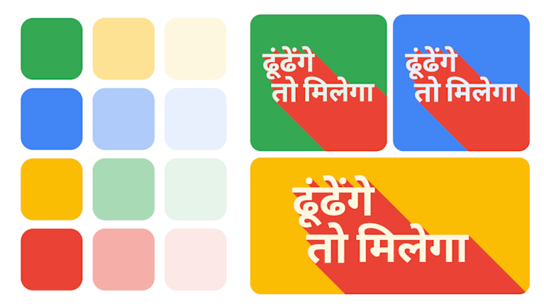
We embarked on a 4-step Brand Visual Identity exercise to develop a complementary visual identity in line with Google’s new brand platform “Dhoondenge Toh Milega” (If You Search for it, you'll find it) - starting with Design Strategy and Visual Exploration, before moving on to BVI Research and Testing, and finally the creation of a new Brand Play Book.
We used our brand platform’s focus on “possibilities” to define our visual identity principles - a free and colourful world that Gen Z thrives in, with emphasis on social media realism, super local-first iconography and typography, nodding to love for culture and language, and a no-holds-barred approach to diversity.
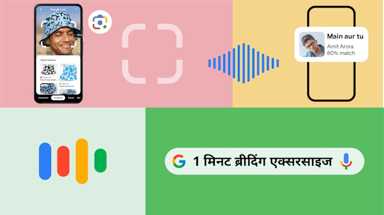
We developed a playbook for a fresh and energised but rooted and mature Google in India. This included a colour palette, photography guidelines, big and bold typography and confident owning of the logo and branding, showcasing importantly how the use of logo and UI would translate across touchpoints.
Results
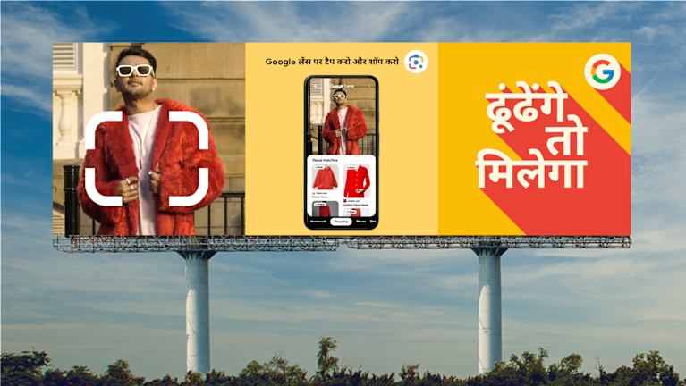
We demonstrated what the brand new world of Google in India would look like, bringing our Playbook to life across an assortment of assets, from performance assets and social to outdoors.
The "Dhoondenge Toh Milega" campaign launched our new brand visual identity for the world to see, resonating with millions across the country.
