We've made Google's much-loved data visualisation tool more powerful than ever, adding a whole new suite of features and customisations for the modern day.
Challenge
Google News Lab approached Toaster requesting a simple way for journalists, bloggers and businesses to create engaging animated data comparisons to enhance their storytelling.
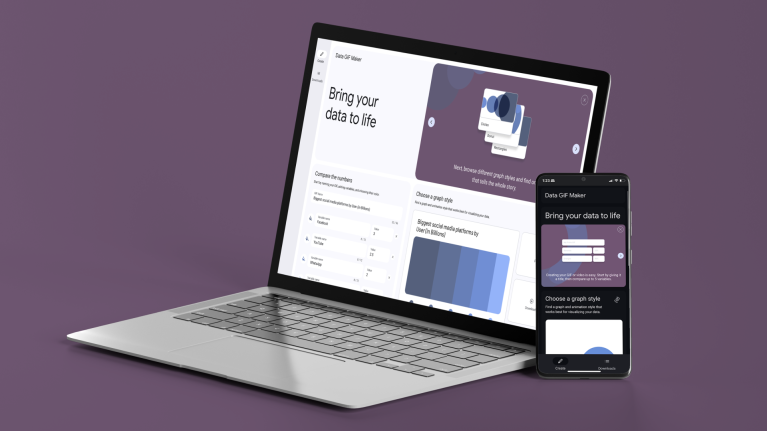
In the past, we had created rudimentary data visualization tools for Google, but the vision for this site was much greater. To make the site more powerful, we needed to add bells and whistles like high quality outputs, a more modern & intuitive user experience, and a variety of customization features.
Approach
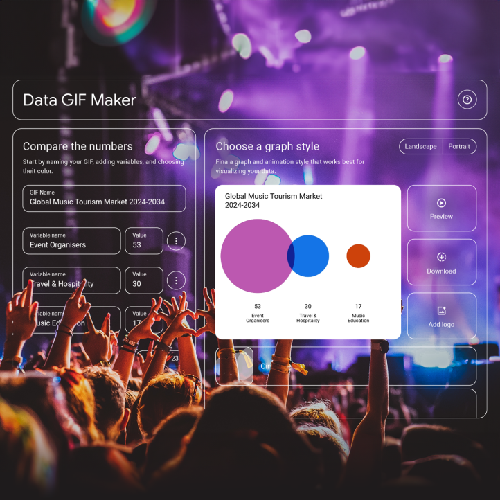
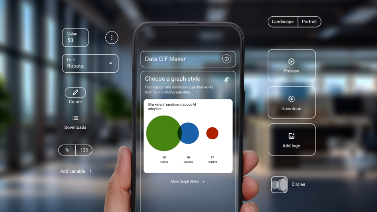
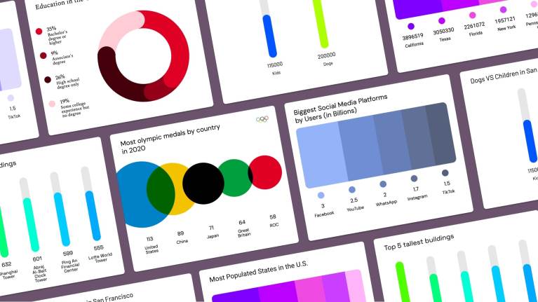
We began by designing a wide range of animated data visualization templates using bar charts, donuts, heat maps, scatter plots and basic geometric area graphs. We settled on 4 graph styles that were visually unique, but simple enough to generate and display legibly on mobile. We also needed the user experience to be streamlined so that users could create GIFs on any device with a fully accessible interface. Using Google’s Material 3 design system, we landed on a modular dashboard approach that allowed users to preview animations live while inputting variables, selecting themes, and adjusting colors to best display their data.
Results
Because our team is full of content creators and visualization experts, we pushed to include features that would be useful in our daily presentations – like a websafe color picker, the ability to add a logo, multiple font choices and export formats, and a continuous log of previous data GIF creations.
The site launched successfully in July 2024! Give it a whirl at datagifmaker.withgoogle.com.
